Predicting High Cost Diabetes Patients using Ridge Regression and Random Forests
Overview
Disease management programs provide organized, proactive care to patients with specific conditions in order to help control costs associated with avoidable complications. Since funds are limited, it is important to identify patients that will benefit the most from these programs.
This section uses a few machine learning techniques (logistic regression, ridge regression, and random forests) to predict future high cost diabetes patients.
R code for the analysis can be found here, which needs this dataset.
Data
We first load the data and examine some summary statistics.
library("data.table")
meps <- fread("data/mepsdiab.csv")
summary(meps$totexp)
##    Min. 1st Qu.  Median    Mean 3rd Qu.    Max.
##       0    2054    4958   11186   11795  616631
The data consists of all diabetes patients from the 10th - 17th panels of the Medical Expenditure Panel Survey (MEPS). The data combines information from the full-year consolidated data files and the medical conditions files.
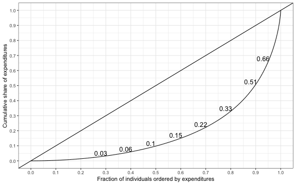
Mean expenditures are high, although the expenditure distribution is quite skewed. We can examine the skewness of the distribution with a Lorenz curve, which plots the cumulative share of expenditures on the y-axis and the cumulative share of the population on the x-axis.
library("ineq")
library("ggplot2")
theme_set(theme_bw())
lorenz <- Lc(meps$totexp)
lorenz <- data.table(p = lorenz$p, L = lorenz$L)
frac <- c(seq(.3, .9, .1), .95)
quants <-  data.table(quant = quantile(lorenz$L, probs = frac),
                      frac)
ggplot(lorenz, aes(x = p, y = L)) + geom_line() +
  geom_abline() + coord_cartesian(xlim = c(0, 1), ylim = c(0, 1)) +
  xlab("Fraction of individuals ordered by expenditures") +
  ylab("Cumulative share of expenditures") + theme(legend.title=element_blank()) +
  scale_x_continuous(breaks = seq(0, 1, by = .1))  +
  scale_y_continuous(breaks = seq(0, 1, by = .1))  +
  theme(legend.position = "bottom") +
  geom_text(data = quants, aes(x = frac - .02, y = quant + .02,
                              label = round(quant, 2), size = 8),
            show.legend  = F)
 There are considerable differences in spending among those with diabetes, as the top 10 percent of spenders account for 49.24 percent of all spending. We can summarize the degree of inequality in spending using the Gini coefficient; in R, we use the command
 Gini(meps$totexp), which yields a value of 0.63. The distribution of health spending (among patients with diabetes) is therefore more unequal than the distribution of income (pre taxes and transfers) in the most unequal countries in the world.
Since spending is highly concentrated disease management programs could potentially reduce costs significantly if they could identify future high spenders.
Modeling
For the purpose of this analysis, we will classify high cost patients as those in the upper 10th percentile of the spending distribution. The primary predictor variables (or features) are spending in the previous year and an indicator variable for being a high spender in the previous year. Other variables include age, self-reported health status, how diabetes is being treated (with diet, medication, and/or insulin), whether diabetes has caused kidney or eye problems, and single-level clinical classification system (CCS) categories (i.e. comorbidities).
ccsnames <- names(meps)[grep("^ccs\\d\\d\\d", names(meps))]
ds <- c("dsdiet", "dsmed", "dsinsu", "dseypr", "dskidn")
xvars <- c("l_topexp", "l_totexp", "age", "srh", ds, ccsnames)
meps <- meps[, c("dupersid", "panel", "year", "topexp", "totexp",
                 xvars), with = FALSE]
Data from the 10th - 15th panels is used as training data and data from the 16th and 17th panels is used as test data.
train <- meps[panel <= 15]
train <- train[complete.cases(train)]
test <- meps[panel > 15]
test <- test[complete.cases(test)]
Logistic Regression
Logistic regression is commonly used to predict binary outcomes. We estimate a logistic regression using the training data and then calculate the predicted probability of being a high spender on the test data.
Fm <- function(y, x){
  return(as.formula(paste(y, "~", paste(xvars, collapse = "+"))))
}
logistic <- glm(Fm("topexp", xvars), family = binomial, train)
p.logistic <- predict.glm(logistic, test, type = "response")
Logistic Ridge Regression
It is worth noting that the logistic regression above includes all CCS categories as predictor variables. This is problematic because 1) some CCS categories are very uncommon and 2) the CCS categories are highly collinear. As a result, the variances of the regression coefficients are large.
Ridge regression—which penalizes large coefficient estimates—is often used to deal with these issues. Below I use the glmnet package to estimate a logistic ridge regression. The degree to which the regression coefficients are shrunk toward zero is determined by the parameter \(\lambda\). Predictions are made using a value of \(\lambda\) that minimizes the model deviance in 10-fold cross-validation.
library("glmnet")
x.train <- model.matrix(Fm("topexp", xvars), train)[, -1]
y.train <- train$topexp
x.test <- model.matrix(Fm("topexp", xvars), test)[, -1]
y.test <- test$topexp
cv.ridge <- cv.glmnet(x.train, y.train, family = "binomial", alpha = 0)
p.ridge <- predict(cv.ridge, x.test, s = "lambda.min", type = "response")
Random Forests
Classification trees are non-linear predictive models commonly used for classification. Random forests aggregate predictions from multiple trees in order to improve prediction accuracy. In the random forest algorithm, \(m\) predictor variables are randomly chosen at each node of each tree. Model performance depends on the parameter \(m\) so it should be treated as a tuning variable. However, in this case, the default value of \(m=\sqrt{p}\) where \(p\) is the number of predictor variables turned out to be sensible and is consequently used for predictions. Furthermore, the number of trees had very little effect on classification error rates and was set to 501.
Here, I implement the random forest algorithm using the randomForest package in R.
library("randomForest")
set.seed(101)
train$srh <- as.numeric(train$srh)
x.train <- model.matrix(Fm("topexp", xvars), train)[, -1]
y.train <- as.factor(y.train)
rf <- randomForest(x = x.train, y = y.train, ntree = 501,
                   importance = TRUE, do.trace= FALSE)
test$srh <- as.numeric(test$srh)
p.rf <- predict(rf, test, type = "prob")
Evaluation
The Brier score is commonly used to asses the accuracy of binary predictions. It can be calculated as \(1/N\sum_{i=1}^N (p_i-y_i)^2\), where \(N\) is the total number of patients, \(p_i\) is the probability that patient $i$ is a high spender, and \(y_i\) is an indicator variable equal to 1 for high spenders and 0 otherwise.
Brier <- function(p, y) mean((p - y)^2)
c(Brier(p.logistic, y.test), Brier(p.ridge, y.test),
  Brier(p.rf[, 2], y.test))
## [1] 0.07274953 0.06464060 0.06606398
As expected, the logistic ridge regression and the random forest perform considerably better than the logistic regression.
So far, we have predicted the probability that each patient is a higher spender. In order to classify patients we must choose some cutoff point that differentiates high spenders from low spenders. Letting \(\hat{y}_i\) be the predicted class of patient $i$, our cutoff should be chosen to balance the sensitivity and specificity of the classifier, where,
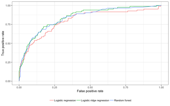
\[\begin{aligned} \rm{sensitivity:}\; &Pr(\hat{y}_i = 1| y_i = 1) \\ \rm{specificity:}\; &Pr(\hat{y}_i = 0| y_i = 0). \end{aligned}\]In our context, we might be willing to decrease specificity in order to increase sensitivity so that we can target more high risk patients. This tradeoff can be represented with a receiver operating curve (ROC), which plots the true positive rate (sensitivity) on the y-axis and the false positive rate (1 -specificity) on the x-axis.
The ROCR package provides a simple way to plot ROC curves using base R. I prefer the graphics in ggplot, so the code below uses ggplot to plot ROC curves using ROCR objects.
library("ROCR")

# predictions
p.mat <- cbind(p1 = p.logistic, p2 = p.ridge[, 1], p3 = p.rf[, 2])
labels.mat <- matrix(y.test, nrow = length(y.test), ncol = ncol(p.mat))
pred <- prediction(p.mat, labels.mat)

# roc curve
perf <- performance(pred, "tpr", "fpr")
roc.dat <- data.frame(fpr = do.call("c", perf@x.values),
                       tpr = do.call("c", perf@y.values))
len <- do.call("c", lapply(perf@x.values, length))
roc.dat$lab <- rep(c("Logistic regression", "Logistic ridge regression",
                     "Random forest"), times = len)
ggplot(roc.dat, aes(x = fpr, y = tpr, col = lab)) + geom_line() +
  xlab("False positive rate") +
  ylab("True positive rate") + theme(legend.title=element_blank()) +
  theme(legend.position = "bottom")
 The area under the ROC curve, or the AUC, can be used to summarize the performance of the models. It has a nice interpretation because it can be shown to be equal to the Wilcoxon rank-sum test, or as the proportion of random pairs consisting of a high cost and a non high-cost patient in which the model assigns a higher probability of being a high cost patient to the actual high cost patient.
auc <- as.numeric(performance(pred, "auc")@y.values)
print(auc)
## [1] 0.8003307 0.8446820 0.8351444
We can see that both the logistic ridge regression and the random forest yield similar results.
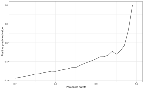
Another important quantity of interest for disease management programs is the positive predictive value (PPV), or \(Pr(y_i=1 \mid \hat{y}_i =1)\). Below, I plot this value using the logistic ridge regression against threshold values defined in terms of the percentage of the population with predictive probabilities above the cutoff.
ppv.dat <- data.frame(pred = p.ridge[, 1], y = y.test, exp = test$totexp)
ppv.dat$ecdf.p <- ecdf(ppv.dat$pred)(ppv.dat$pred)
pctile <- seq(.7, 1, .01)
tp <- rep(NA, length(pctile))
for (i in 1:length(tp)){
  yhat <-  1 * (ppv.dat$ecdf.p > pctile[i])
  tp[i] <- mean(ppv.dat$y[which(yhat == 1)])
}
ggplot(data.frame(x = pctile, y = tp), aes(x = x, y = y)) + geom_line() +
  xlab("Percentile cutoff") + ylab("Positive predicted value") +
  geom_vline(xintercept = 0.9, lty = "dotted", col = "red")
 The PPV is increasing in the threshold value which means that there is a tradeoff between correctly identifying high spenders and the number of patients identified. Indeed, if the cutoff is chosen so that only 10 percent of patients are targeted, then the PPV is only 0.43.
One way to examine the potential success of the disease management program is to compare observed spending by predicted high spenders to observed spending by actual high spenders.
fsaf <- sum(ppv.dat$exp[ppv.dat$ecdf.p >= .9])/sum(ppv.dat$exp[ppv.dat$y == 1])
print(fsaf)
## [1] 0.701832
We can see that the sum of spending by top 10 percent of predicted high spenders is 70 percent of the total amount spent by the observed high spenders. Overall, these results suggests that it is quite difficult to identify the highest spending diabetes patients.